
 We are currently working on designing a new poster for Outsourced. Feel free to voice your opinions and leave a comment on this page.
Do you prefer the Sky? (Below)
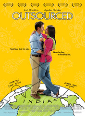
The Yellow/Gold? (left)
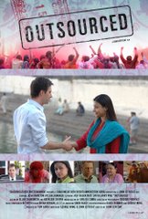
Or the original poster shown on the homepage of this blog??? (Right)
Monday, July 30, 2007
Choosing Posters.
Subscribe to:
Post Comments (Atom)


11 comments:
I like the poster with the sky, especially because the two main characters are "standing" on the earth. Good idea with the telephone cable! This is a very lovely poster with nice colors.
I like the original poster featured on the front page of this blog. I think it's classy.
Ann
www.joshhamiltonactor.com
I love the poster with the sky! It looks so polished and really gets the point accross that it's a small small world.
On a separate note, I've been tracking the progress of this movie! Congratulations on all the awards - I can't wait until it's out for general distribution and I can finally WATCH it!
yellow. its the way better eyecatcher.
the sky one is a bit too cheesy for my taste :D
sorry me again :D about the original poster. i love it, but i feel that its better suited for festivals or arthouse audiences.
I agree with Claudia: the blue looks better. Congratulations, on all of awards. I saw your film last year in Toronto and thought I was spectacular!
--Anxiously awaiting it to go for general distribution or to DVD so I can watch it again and again!
Hmm the sky may seem a bit cheesy, yes, but the yellow one reminds me too much of the German DVD-Cover/Poster of "Hum Tum".
I like yellow!
I vote for the blue too.
I also prefer the poster with the sky, but not b/c of the sky necessarily. I prefer the tag line b/c I don't like the sexual reference in the yellow poster: "positions." If the poster was hanging up at my local movie house I would be embarrassed to have my children see it. I would definitely say that the original poster is too artsy for a regular audience and that either the yellow or blue would be much more appealing.
I would definitely go with the yellow background - except I might enhance the subtle indian-esque designs. Part of me really prefers the original poster - it seems more "true" to the spirit of the film, but the more simple one will surely have more commercial appeal and "pop". And I love the double-meaning of "position" - that is a GREAT tagline. There's my 2-cents.
-Travis Alden
Director, Hardacre Film & Cinema Festival
Post a Comment